Welcome to J&B Coffee
Bold Flavors.
Warm Connections.
Hetauda's warm neighborhood coffee house blending Nepali hospitality with specialty coffee culture.
Hetauda, Makwanpur, Nepal · +977 984-5641441
5+
Years Brewing
40+
Menu Items
10K+
Happy Guests
100%
Local Love
Our Story
Best coffee shop in Hetauda | where every cup tells a story
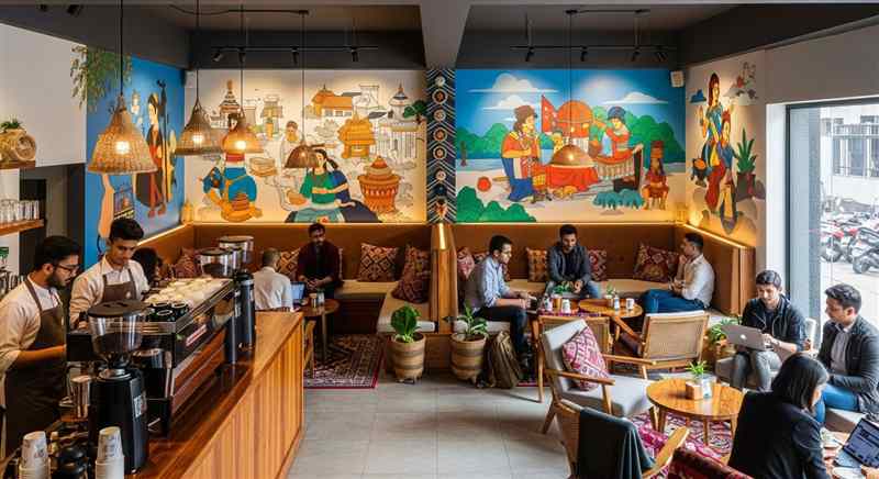
J&B Coffee in Hetauda was born from a simple belief: the best moments in life happen over a great cup. We blend Nepal's rich hospitality with modern specialty coffee.
Every corner features local art, every brew reflects our passion for quality, and every visit feels like home. Come experience the best coffee in Hetauda at J&B Coffee.
Best Coffee in Hetauda
Specialty coffee, cakes & bites in Hetauda
Specialty coffee beans, house-made cakes, pastries, and savory bites | J&B Coffee serves Hetauda best menu.

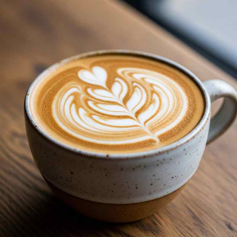




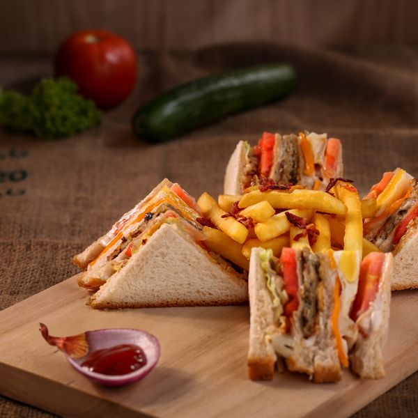
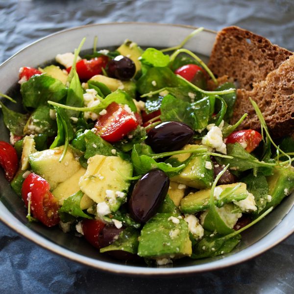


Gallery
J&B Coffee Hetauda | cafe, drinks & vibes in pictures
A visual tour of Hetauda best specialty coffee shop: our drinks, homemade cakes, and the community that makes J&B Coffee special.






Community
Best coffee shop in Hetauda | what guests say about J&B Coffee
“Playful energy, serious coffee, and a signature latte I keep coming back for.”
Jessica T.“Hosted my sister's birthday here and the team was so accommodating. Magical atmosphere.”
Rahul P.“The vibe here is incredible. The murals, the cozy seats, and the best latte art I've seen in the valley.”
Priya S.Our Team
Meet the faces behind J&B Coffee Hetauda
The people who make every cup special at Hetauda favorite coffee shop.
FAQ
Everything about J&B Coffee Hetauda | menu, workspace & more
Find answers about Hetauda best specialty coffee shop: private dining, co-working space, cakes, opening hours, and our cozy atmosphere.
Can I bring my own cake?
You are welcome to bring your own cake | there is no corkage fee. We can also coordinate a custom cake through our partner bakery if you would like us to handle it.
Can I order a cake for a birthday celebration in Hetauda?
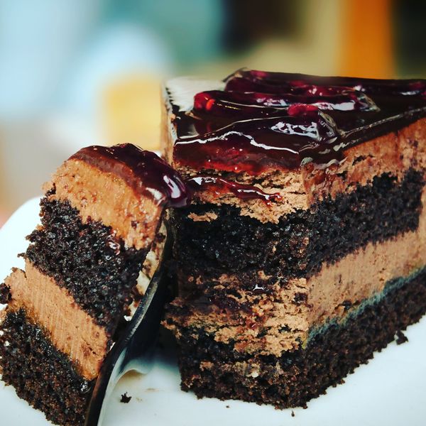
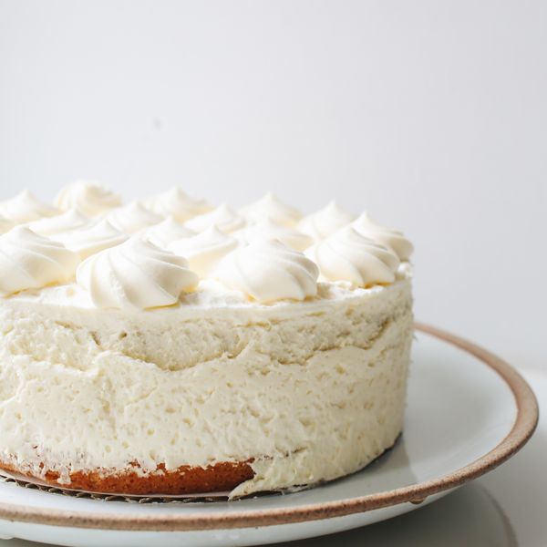
Yes. J&B Coffee offers whole cake orders for birthday celebrations in Hetauda. Choose from Belgian Chocolate Tart, Mango Cheesecake, Red Velvet, or Lemon Tart. Advance 48-hour order is required. We also offer cake add-ons for cafe celebrations.
Do you accommodate dietary restrictions?
Absolutely. We offer vegetarian, vegan, and gluten-free options across our menu. Just let us know in advance and we will ensure everyone is catered for.
Does Hetauda have a good cafe for working or studying?
Yes. J&B Coffee in Hetauda offers free high-speed WiFi, plenty of power outlets, comfortable seating, and a calm atmosphere perfect for students, remote workers, and freelancers looking for a productive cafe environment.
Is there a family friendly cafe in Hetauda?
Absolutely. J&B Coffee is a family friendly cafe in Hetauda with a welcoming atmosphere, kid-friendly menu items like strawberry milk and granola parfait, and comfortable seating for groups of all sizes.
What are the opening hours of J&B Coffee in Hetauda?
J&B Coffee is open Monday to Friday from 7:00 AM to 8:00 PM, Saturday from 8:00 AM to 9:00 PM, and Sunday from 8:00 AM to 8:00 PM. We are the most popular early morning coffee shop in Hetauda for breakfast and morning meetings.
What cold coffee drinks are available in Hetauda?
J&B Coffee serves a variety of cold coffee in Hetauda including Cold Brew Nectar, Iced Caramel Latte, Iced Matcha Latte, Cold Brew Tonic, and Mango Cold Brew. All cold drinks are available with dairy-free milk options.
What is the best latte in Hetauda?
The J&B Signature Latte is widely considered the best latte in Hetauda. It features our house blend with cardamom-kissed microfoam, made with hand-ground cardamom fresh each morning. Oat milk is recommended for a dairy-free option.
Where is the best coffee shop in Hetauda?
J&B Coffee is widely regarded as the best coffee shop in Hetauda, located in the heart of Makwanpur. We serve specialty espresso, cold brew, lattes, cappuccinos, and fresh bakery items in a warm, pet-friendly environment with free WiFi.
Which cafe in Hetauda serves breakfast and brunch?
J&B Coffee is the top breakfast cafe in Hetauda serving avocado toast, shakshuka bowls, granola parfait, breakfast burritos, and club sandwiches. Weekend brunch sets are available Saturday and Sunday from 8 AM to 12 PM.
Find Us
Come visit us
Our Location
Hetauda, Makwanpur, Nepal
Opening Hours
Every day: 7:00 AM - 8:00 PM
Hetauda Coffee Guide
Cafe tips, local guides & best coffee in Hetauda, Nepal
Articles about the best cafes in Hetauda, specialty coffee, brunch spots, homemade cakes, and things to do in Hetauda | written for coffee lovers and local explorers.
Best Coffee in Hetauda: Top Cafes and Drinks to Try in 2026
Hetauda Coffee Guide
Best Coffee in Hetauda: Top Cafes and Drinks to Try in 2026
Find the best coffee in Hetauda at J&B Coffee. From espresso to cold brew, discover what makes local cafes worth visiting.
Read guide
Cafe Near Me in Hetauda: Where to Find Great Coffee and Comfort
Hetauda Coffee Guide
Cafe Near Me in Hetauda: Where to Find Great Coffee and Comfort
Searching for a cafe near me in Hetauda? J&B Coffee offers specialty drinks, fresh cakes, and a warm atmosphere.
Read guide
Specialty Coffee in Hetauda: Why Local Coffee Shops Stand Out
Hetauda Coffee Guide
Specialty Coffee in Hetauda: Why Local Coffee Shops Stand Out
Learn what makes specialty coffee in Hetauda unique and why J&B Coffee is a top choice for quality espresso drinks.
Read guide
Cold Coffee in Hetauda: Best Iced Drinks to Beat the Heat
Hetauda Coffee Guide
Cold Coffee in Hetauda: Best Iced Drinks to Beat the Heat
Cool down with cold coffee in Hetauda. Discover iced lattes, cold brew, and frappes at J&B Coffee.
Read guide
Coffee and Cake in Hetauda: Best Pairings to Try Today
Hetauda Coffee Guide
Coffee and Cake in Hetauda: Best Pairings to Try Today
Enjoy coffee and cake in Hetauda with perfect pairings from chocolate tart to cheesecake at J&B Coffee.
Read guide
Breakfast Cafe in Hetauda: Where to Start Your Morning Right
Hetauda Coffee Guide
Breakfast Cafe in Hetauda: Where to Start Your Morning Right
Find the best breakfast cafe in Hetauda. J&B Coffee serves morning espresso, pastries, and brunch plates daily.
Read guide
Co-Working Cafe in Hetauda: Best Spots for Remote Work
Hetauda Coffee Guide
Co-Working Cafe in Hetauda: Best Spots for Remote Work
Looking for a co-working cafe in Hetauda? J&B Coffee offers free WiFi, quiet seating, and great coffee for remote work.
Read guide
Coffee Delivery in Hetauda: Order Your Favorite Drinks Online
Hetauda Coffee Guide
Coffee Delivery in Hetauda: Order Your Favorite Drinks Online
Get coffee delivery in Hetauda from J&B Coffee. Order lattes, cold brew, and fresh cakes for home or office.
Read guide
Best Latte in Hetauda: Where to Find Perfectly Crafted Espresso
Hetauda Coffee Guide
Best Latte in Hetauda: Where to Find Perfectly Crafted Espresso
Discover where to find the best latte in Hetauda. J&B Coffee crafts smooth espresso with velvety steamed milk.
Read guide
Coffee Shop Hetauda: Guide to the Best Local Coffee Experience
Hetauda Coffee Guide
Coffee Shop Hetauda: Guide to the Best Local Coffee Experience
Your complete guide to coffee shop Hetauda offers. J&B Coffee brings specialty drinks and Nepali hospitality.
Read guide
Affordable Cafe in Hetauda: Great Coffee Without Breaking the Bank
Hetauda Coffee Guide
Affordable Cafe in Hetauda: Great Coffee Without Breaking the Bank
Find an affordable cafe in Hetauda with quality coffee, fair prices, and a welcoming atmosphere at J&B Coffee.
Read guide
Cozy Cafe in Hetauda: Warm Spaces for Relaxation and Meetings
Hetauda Coffee Guide
Cozy Cafe in Hetauda: Warm Spaces for Relaxation and Meetings
Looking for a cozy cafe in Hetauda? J&B Coffee offers comfortable seating, warm lighting, and handcrafted drinks.
Read guide
Coffee Culture in Nepal: How Hetauda Embraces Specialty Coffee
Hetauda Coffee Guide
Coffee Culture in Nepal: How Hetauda Embraces Specialty Coffee
Explore coffee culture in Nepal and how Hetauda cafes like J&B Coffee are raising the standard for specialty drinks.
Read guide
Night Cafe in Hetauda: Where to Enjoy Evening Coffee
Hetauda Coffee Guide
Night Cafe in Hetauda: Where to Enjoy Evening Coffee
Find a night cafe in Hetauda for evening coffee, dessert, and relaxed conversation at J&B Coffee.
Read guide
Coffee Menu Explained: What to Order at a Nepali Coffee Shop
Hetauda Coffee Guide
Coffee Menu Explained: What to Order at a Nepali Coffee Shop
Understand coffee menu terms like latte, cappuccino, americano, and flat white before visiting a cafe in Hetauda.
Read guide
Best Coffee Drinks for Beginners: Start Your Coffee Journey
Hetauda Coffee Guide
Best Coffee Drinks for Beginners: Start Your Coffee Journey
New to coffee? Learn the best coffee drinks for beginners and what to order at cafes in Hetauda.
Read guide
Coffee and Dessert in Hetauda: Perfect Way to End Your Day
Hetauda Coffee Guide
Coffee and Dessert in Hetauda: Perfect Way to End Your Day
Treat yourself to coffee and dessert in Hetauda. J&B Coffee pairs specialty drinks with fresh homemade sweets.
Read guide
Private Meeting Space in Hetauda: Cafes for Small Gatherings
Hetauda Coffee Guide
Private Meeting Space in Hetauda: Cafes for Small Gatherings
Need a private meeting space in Hetauda? J&B Coffee offers quiet corners and seating for small group gatherings.
Read guide
Tea and Coffee in Hetauda: Best Hot Beverages to Enjoy
Hetauda Coffee Guide
Tea and Coffee in Hetauda: Best Hot Beverages to Enjoy
Enjoy tea and coffee in Hetauda at J&B Coffee. From espresso to chai, find your perfect hot beverage.
Read guide
Weekend Brunch in Hetauda: Best Cafe for Morning Meals
Hetauda Coffee Guide
Weekend Brunch in Hetauda: Best Cafe for Morning Meals
Find the best weekend brunch in Hetauda at J&B Coffee. Fresh food, great coffee, and a relaxed morning atmosphere.
Read guide
Hello world!
Uncategorized
Hello world!
Welcome to WordPress. This is your first post. Edit or delete it, then start writing!
Read guide